Media query list~ Browser APIs ~
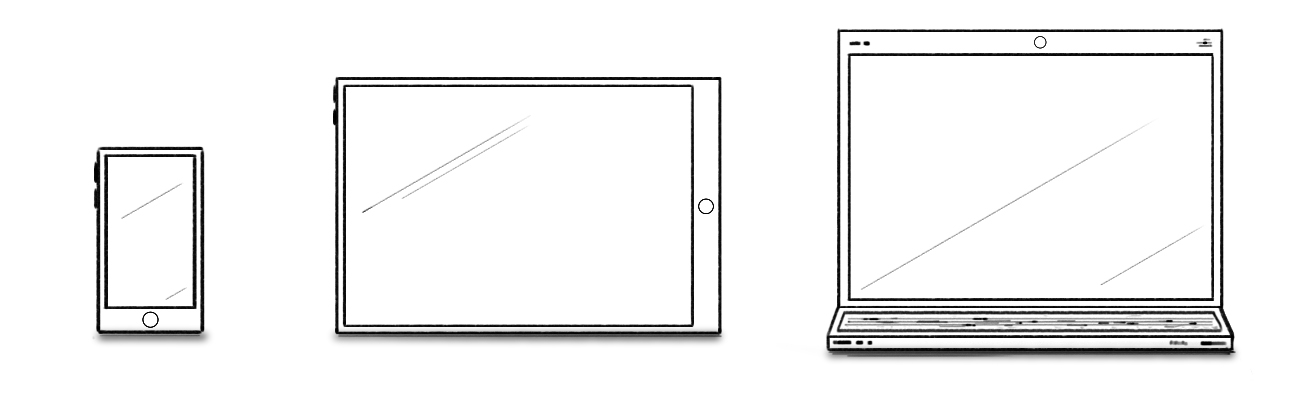
I saw the first article about responsive design in 2010 (by Ethan Marcotte). Since then, the Web has evolved, and so have the developers building websites. Nowadays, responsive architecture is not an option. It's the default.
There are a couple of tools for implementing responsive design. Probably the main one is media queries. It's a CSS feature where we can specify a frame under which our elements behave or/and look differently. For example:
body {
  background-color: blue;
}
@media screen and (max-width: 800px) {
  body {
    background-color: red;
  }
}
The background color of the <body> is by default blue. However, if the browser has a viewport width less than 800px, the color becomes red.
For a long time, this was only available in CSS. That is not the case anymore. We have a MediaQueryList API:
const mediaQueryList = window.matchMedia(
  "(max-width: 800px)"
);
const handle = (mql) => {
  if (mql.matches) {
    console.log("width <= 800px");
  } else {
    console.log("width > 800px");
  }
};

mediaQueryList.addEventListener("change", handle);
handle(mediaQueryList);
We create a media query list object matching our criteria. After that, we can attach a listener that will tell us when our criteria are met.
With this API, we can make truly responsive applications. Not only focusing on how the things look like but also how they work.